


Minimalist Design: 25 Beautiful Examples and Practical Tips - Part1
Minimalism can be described as the stripping away of all unnecessary elements and focusing on what needs to be there. In this sense, minimalism encourages purpose.
While minimalism often appears simple on the outside, a lot of thought, practice and time goes into the production and development of a minimalistic piece. So, here are some ways you can get the most out of minimalism.
01. Get Consistent
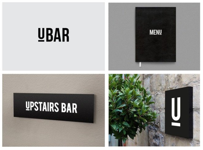
A minimal brand mark can be incredibly useful when it comes to creating a brand identity. Take this bar branding by Simon McWhinnie for example. By keeping the logo super simple and the colour palette very minimal, it has become flexible enough to be used throughout the rest of the branding seamlessly, creating a consistent and very memorable brand.
02. Explore Hidden Relationships
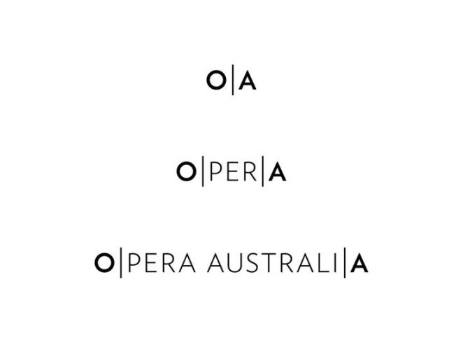
Embracing minimalism in no way means that your design has to be any less creative. In fact, when you’re not bogged down in complex visuals, you often get a chance to explore and play with clever relationships hidden within your design. Have a look at the branding done by Interbrand for Opera Australia, a minimalist design has allowed them to discover a clever relationship with the words ‘OPERA’, ‘OPERA AUSTRALIA’ and ‘OZ OPERA’.
03. Play With Spatial Relationships
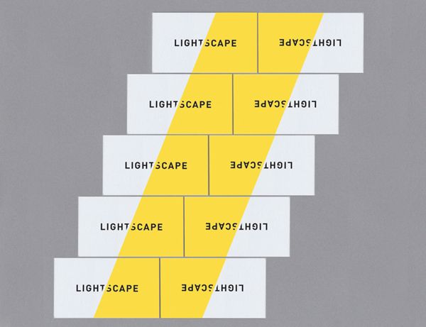
Minimalism can allow you to consider the spatial relationship of your design in a way you might not have before. Consider how your design interacts with other elements to create a wider design, just as these business cards designed by Trevor Finnegan do when lined up.
04. Be Clever
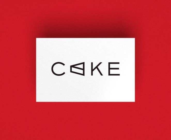
Minimalism isn’t about the complete lack of illustrative elements, but rather the careful choice of when and where to use them. By working an illustrative element that directly relates to the brand name into a logo, similar to the way Frame Creative have done with this branding, you can create a very visual, and yet very minimal design.

05. Embrace Efficiency
Minimalism is often about stripping away all the unnecessary things and focusing on the communication. Have a look at the way this business card from Jake Frey displays his contact information neatly and efficiently, no crazy visuals needed.
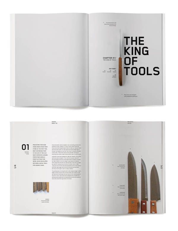
06. Get On The Grid
As you probably already know, grids are very handy (some may say crucial) to a lot of design, and this is especially true for minimalism. As you may not have that many elements within your design, it’s likely a good time to really play up the use of your grid system. Check out this editorial design from Jessica Giboin that uses grids to create a strong sense of alignment with the body copy, headings and graphic elements, generating a clean, simple and effective design.
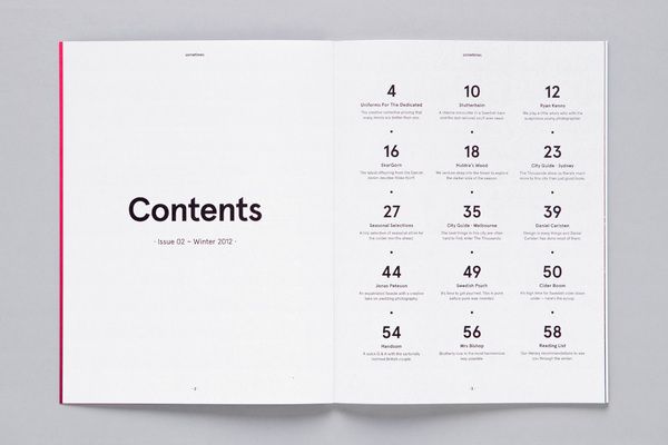
07. Let’s Get Functional
Minimalism can be just brilliant for functionality. A clean, clear and uncluttered design can make navigation and legibility a walk in the park, just as it is with this contents page design from James Kape. The minimal design and the clear typographical hierarchy makes the navigation of this contents page quick, easy and functional.
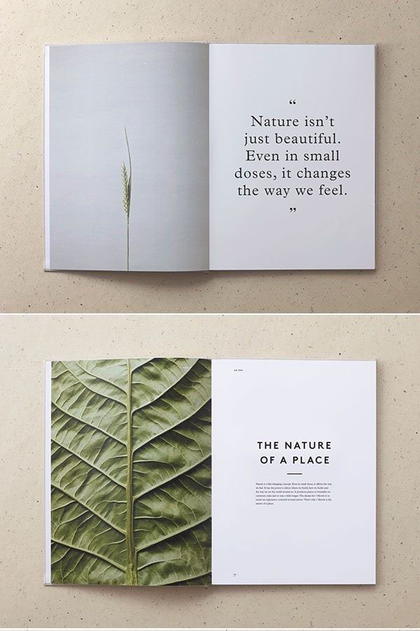
08. Find Your Balance
The relationship between visual elements such as photographs and typographical elements is important to get just right. A good design often ensures that no one element vastly overpowers the other with no good reason. In this publication example from Mother Design, the more simple photographs have been paired with large, attention-grabbing pull quotes, while the more textured and complicated images have been paired with a small piece of body copy creating a balanced harmony between each page.
to be continued…
source: Canva