


Minimalist Design: 25 Beautiful Examples and Practical Tips - Part2
09. Break Some Rules
As previously mentioned, minimalism gives you a specific window to experiment with your design in a way you may not have been able to otherwise, and sometimes this means bending the rules a little. Take this logotype from Ruby Wight for example, presenting half of a logotype upside down seems like a bit of a crazy decision to make, one that in any other case would ruin the legibility. But, thanks to the extreme simplicity and minimal nature of the branding, this crazy decision actually works really well as a visual element.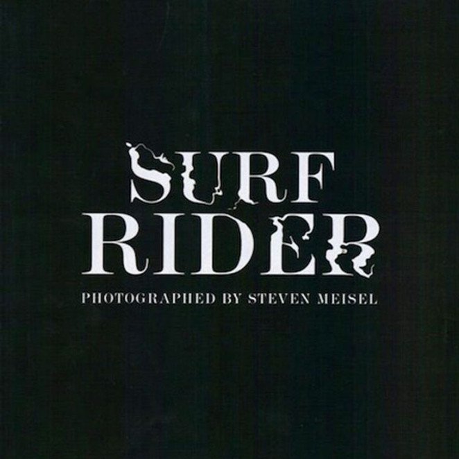
10. Make Your Type Visual
Type is an important weapon to not forget about, particularly when it comes to minimalism. It can act as a visual element, especially when it has been tweaked to fit the situation, just as it has been in this opening spread from Italian Vogue. Adjusting the type to look like rippling water creates a strong visual effect without the use of any imagery, leaving the final design simple and clear.
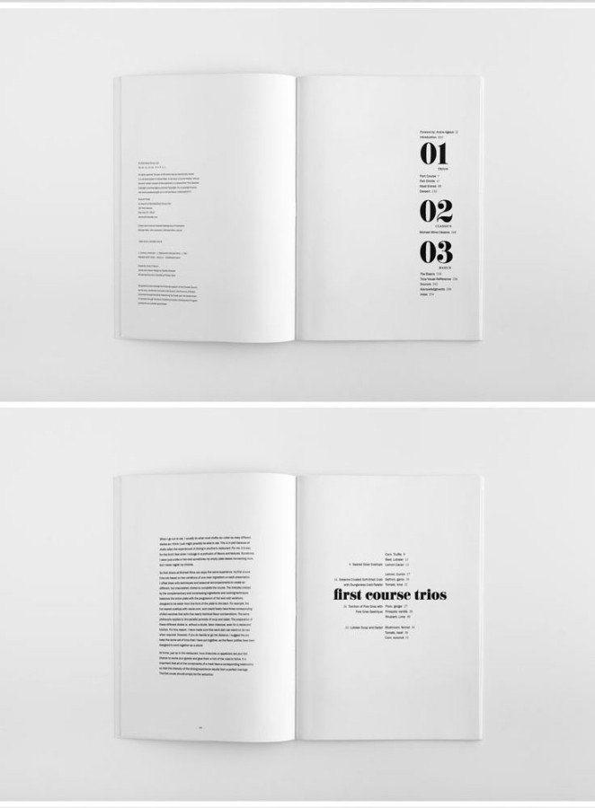
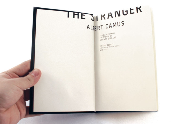
11. White Space Is Alright Space
White space, also known as ‘negative space’, can sometimes be looked at as just empty or blank space, but this is not entirely accurate! When used well, white space can help balance out your design, declutter it and help it breathe. Take a look at this publication example from Studioahamed, where the idea of white space has been leant into and embraced, resulting in a classy and minimal design.
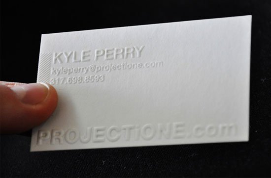
12. Explore Your Options
What’s more minimal than an all-white colour palette? Design doesn’t have to end on the screen, taking it further when it comes to printing can give it a certain unique flair that sets apart your design from the rest. Considering letterpress or embossing effects at your printer can really complement and add depth to a minimal design, as seen in this example from Adam Buente.
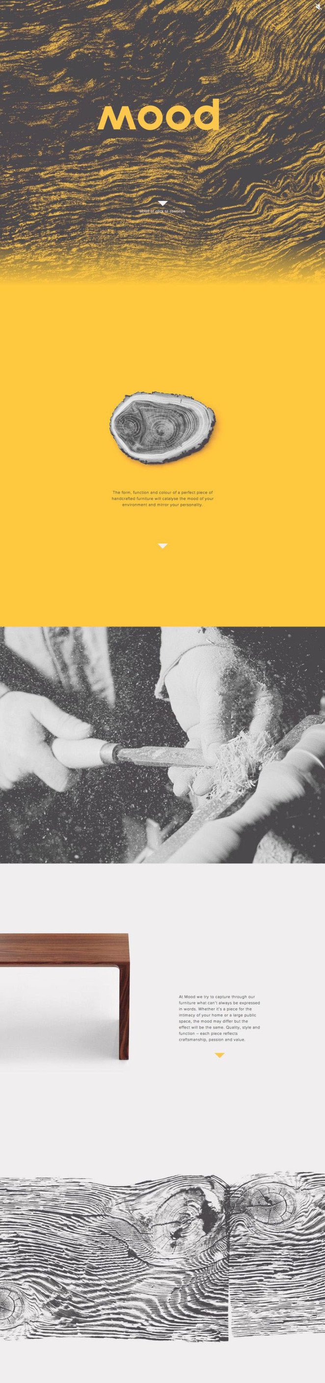
13. Texture
When exploring minimalism, it’s easy to assume that in order to be minimal you need to exclusively use flat colours, but this is definitely not the case. Introducing a little bit of texture into your design can give it that added depth and effectiveness without foregoing your minimalist aspirations. Texture works particularly well when it’s balanced out with clean, flat colours just like those seen on this website/branding example by Watts Design that uses texture to balance out the simple photography and brand mark to create a very effective design.
14. Think Outside The Box
Quite literally. A minimal design can allow you to be a bit more playful with your elements’ positioning and composition, as seen in this publication example from Gregmadeit. The positioning of the type off the edge of the page creates a unique and eye-catching effect without damaging the legibility of the text.
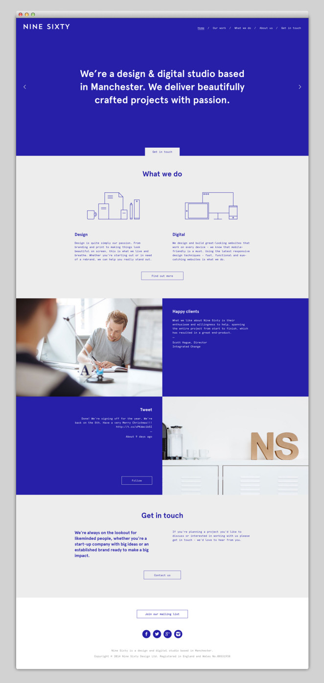
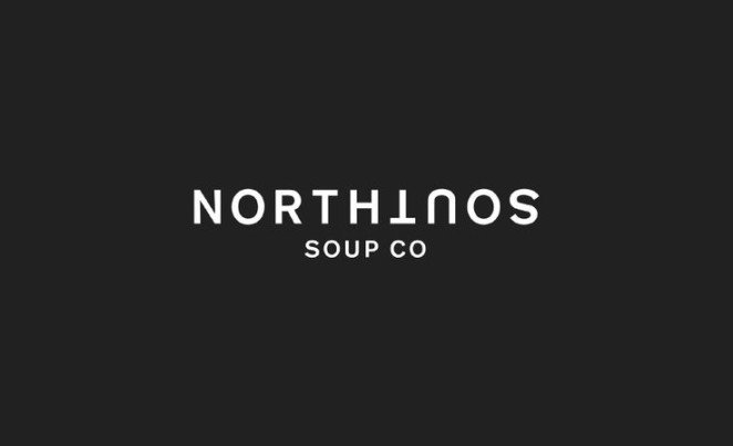
15. Be Direct
When there are less elements fighting to be seen, you are able to be a lot more direct with your message and overall communication. This is especially useful when it comes to web design, as we all tend to skim pages, a direct and plain message of intent, as seen on Nine Sixty’s website, helps give the reader an idea of who they are straight away.
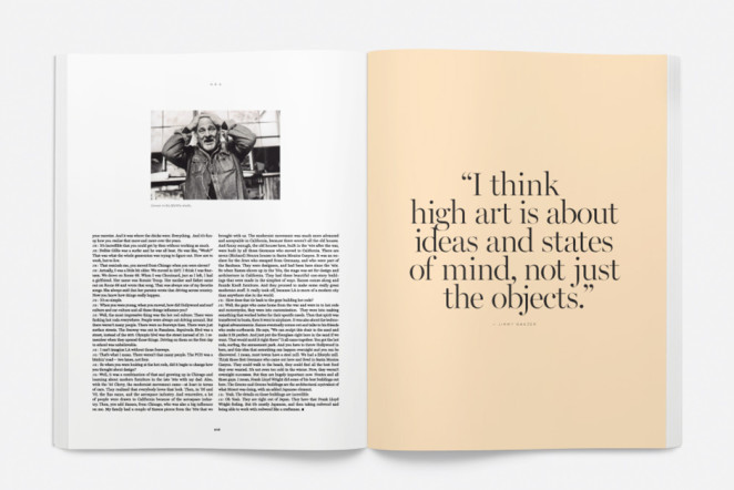
16. Scale It Up
Within minimalism, you tend you have a stronger say on exactly where your audience’s eye goes first, and one way you can achieve this is with scale. Have a look at the elements in this editorial spread from Saturdays Magazine, the eye immediately goes to the largest element: the pull quote on the right page, then the photograph, then the copy. A simple design, when purposely scaled, helps you dictate the exact path your audience will take over your publication.
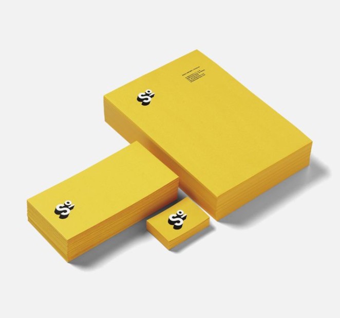
17. Not Everything Is Black And White
Many people believe that monochromatic colour palettes are the be all and end all of minimalism, but this isn’t quite true. Colour can be used to create an eye-catching design without foregoing minimalism, as long as the palette is kept relatively small (1-3 colours is best). Check out this example from Moruba, where the bright yellow paired with the strong white and black logo work together to make a really successful and striking (yet still quite minimalistic) design that is sure to stand out.
to be continued…
Source: Canva