


Minimalist Design: 25 Beautiful Examples and Practical Tips - Part3
18. Be A Bit Flexible
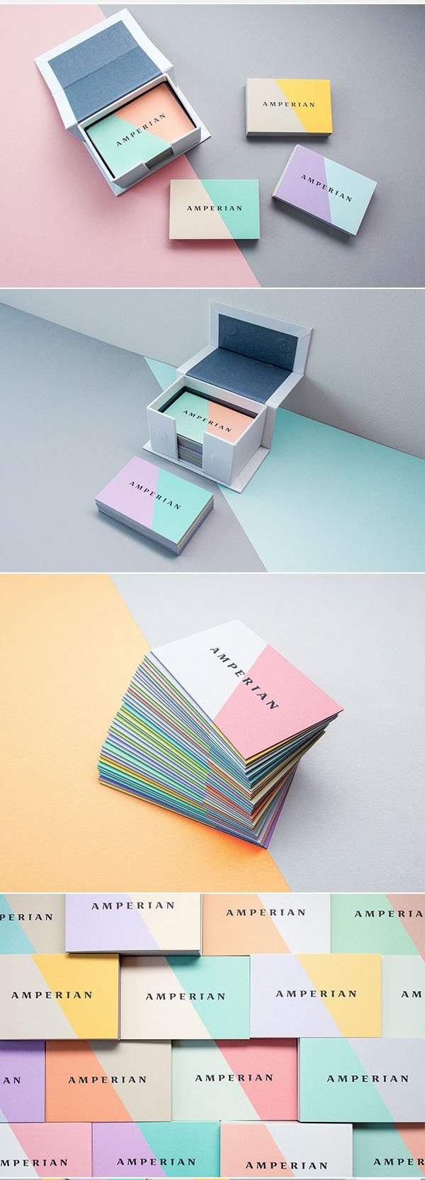
A minimalistic design can really help enhance the flexibility of your design, especially in terms of application. For example, this branding by Büro Ufho consists of a simple serif brand mark and two blocks of flat colour. This particular branding has a high degree of flexibility in terms of its colour palette; the colour of the diagonal blocks are able to change quite easily without losing any of the brand’s integrity, all thanks to a simple, yet unique minimalist design.
19. Get Symbolic
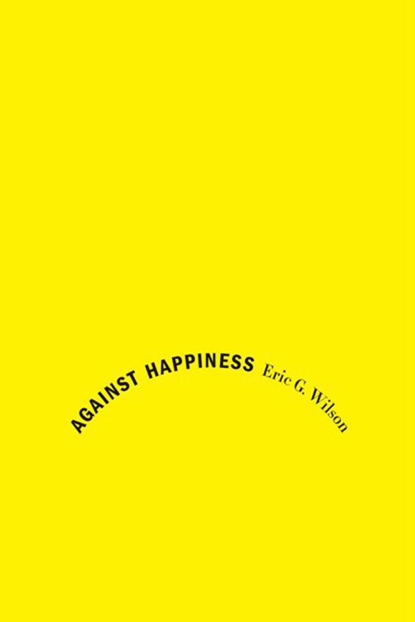
Minimalism is a great chance for you to explore the depth of symbolism with your design. Try and think around an object, about the things associated with the subject, about what the subject stands for. For example, have a look at this design by Jennifer Carrow for the jacket of the non-fiction book “Against Happiness”. By fashioning the type into the symbol of a sad face makes for a clever and memorable design.
20. Iconography
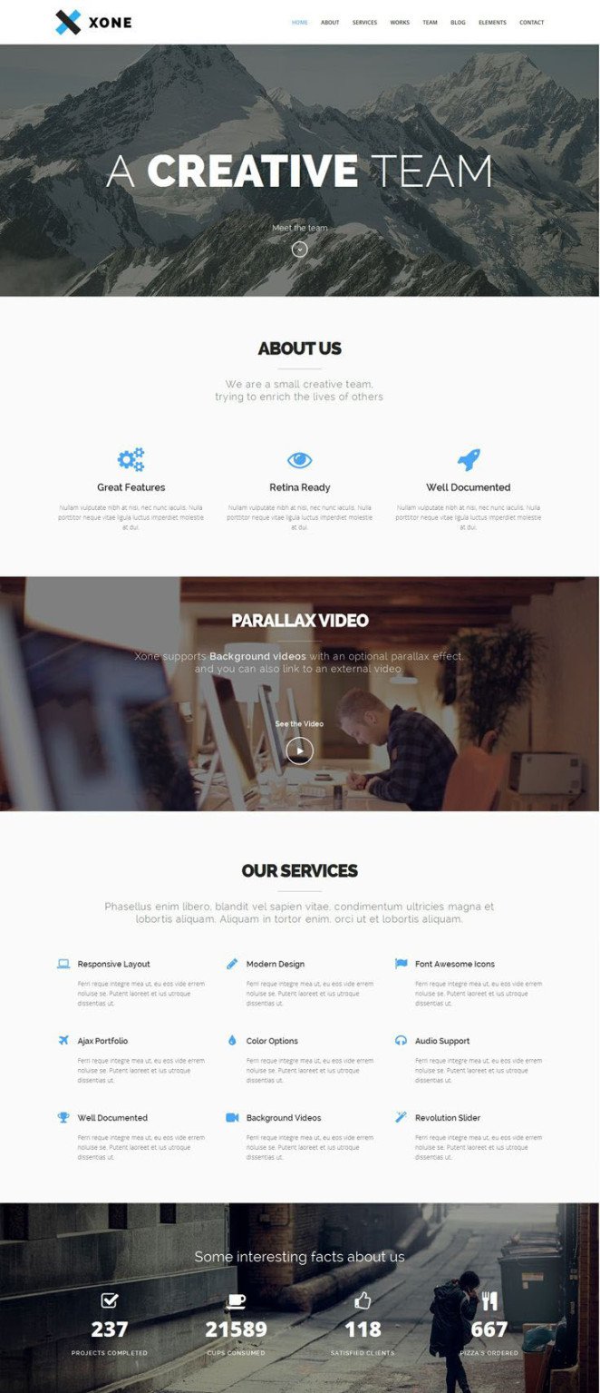
Icons are useful little items that most of us use every day, from app icons to the toolbar icons on your computer. Icons can be used very effectively in the world of minimalism, as well. They can enhance accessibility, reduce the amount of text or type you have on a page and help guide users around your design visually. Have a look at how this website theme by Spab Rice integrates icons throughout the page to help navigation and explain their intent.
21. Think Typographically
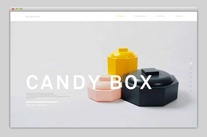
Less is definitely better, particularly when it comes to minimalistic typography. Using 1-3 fonts is your best chance at maintaining a minimal and functional design, just as has been done in this example by Kalpakian. The minimal use of type and the sparing use of fonts creates easy legibility.
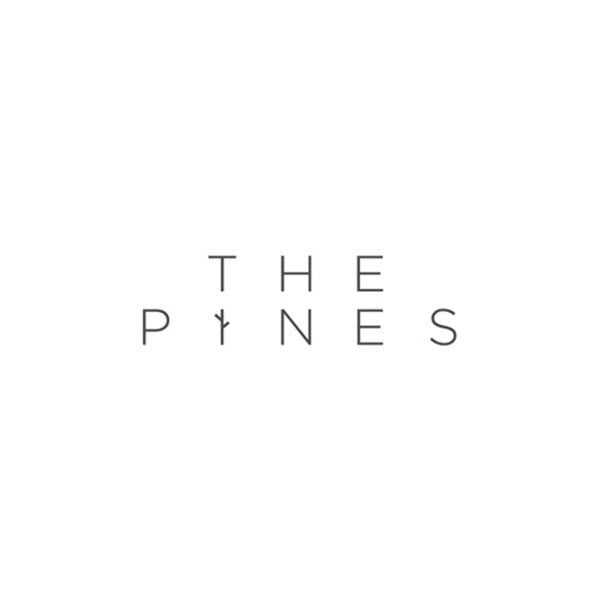
22. Small Adjustments, Big Pay-Off
The beauty of minimalism is the fact that small changes can have big results. Take this logotype for The Pines for example. A simple, sans-serif typeface adjusted with just two strokes creates a small but smart visual that doesn’t tamper with the alignment or minimalism of the logotype.
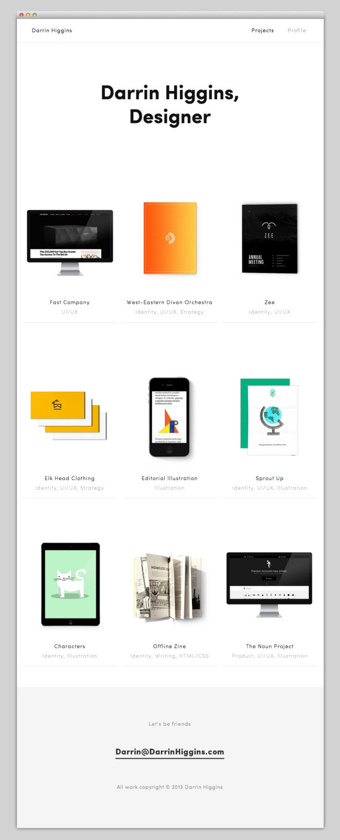
23. Focus
Don’t forget why you started your design: the content. Minimalism works extremely well when it comes to showcasing content as the simplicity of the design allows for the attention to immediately go to the content rather than the business of the page. Have a look at this minimal webpage design by Darrin Higgins that simply allows for the content to be the main focus.
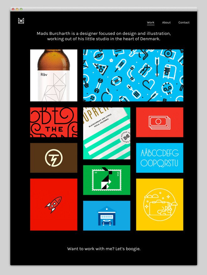
24. Contrast
High contrast designs help put your content and visual elements in the foreground and make for an easily consumed design. In this example, a webpage by Mads Burcharth, the black background of the page contrasts sharply with the vibrant colour of the content images to create a simple but engaging design.
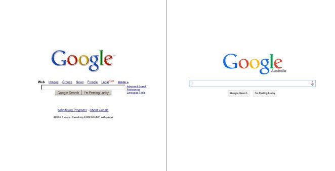
25. Design For The Future
Minimalism can be a vital component to your design as it has the potential to be timeless. The fewer elements your design includes, the less chance they are to go out of style or lose their trendiness. A common and perfect example of this is Google. Take a look at the screenshots below of the Google homepage 10 years ago and today. Despite small changes, the white space, the focus on the content and the ultimate minimalism of the website has kept the design relatively timeless.
Overall, minimalism isn’t necessarily an aesthetic objective or an exact style you can recreate, but rather, it’s a way of thinking about your design.
Typographically, try to limit your use of fonts to create a more cohesive, and less confusing design. Put an emphasis on your use of hierarchy and align your type to a grid of some sort for maximum legibility.
In terms of colour, embrace monochromatic schemes by all means, but don’t feel limited to them. An occasional addition of colour here and there can really help to highlight certain points of your design and draw focus to particular elements.
In general, try to consider what can be removed, whether that is a colour from your palette, or an image from your composition. Consider what can be condensed, what can replaced by something more concise. Simply, reduce it as much as you can until all that remains is what is necessary.
source: Canva