


25 Ways To Design an Awesome Poster: Part 1
Posters are one of my favorite design projects because you can bend the rules so many different ways. They’re creative, bold, groovy and can provoke so many emotions too. Some posters get you excited and pumped up such as music or event posters. And then others are chock full of information. Some may contain much more information than others. The key is finding the right balance with headline, copy, images and logos. When you’ve achieved that, you’ve got one sweet poster.
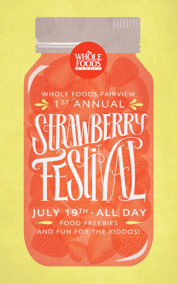
01 Use color to create energy, elicit a mood and attract the eye.
Color is one aspect of the design that’s wide open. Colors will create energy, elicit a mood and attract the eye. Depending on the poster subject, the colors will be bold, subtle or romantic. You can really go all out with color.
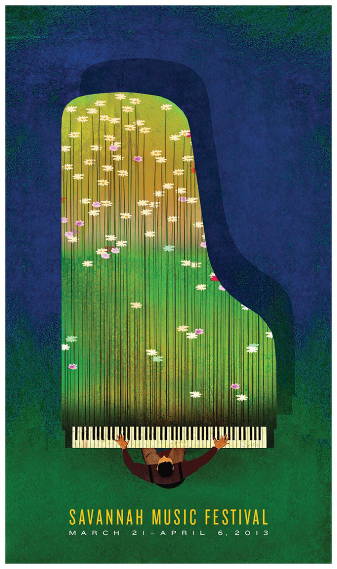
In this example, the Savannah Music Festival poster uses soft, springtime colors. This makes sure the viewer knows it’s an outdoor concert with charming music and not a rock concert.
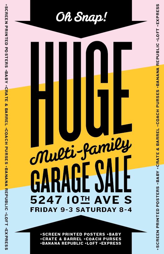
Another idea is to use blocks of solid colors. Ensure that the colors you choose work well together, and you’ll be able to achieve a striking background like the one below.
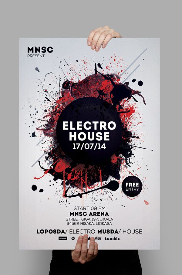
Or, limit your color palette. Note how this event poster achieves an eye–catching contrast using just black and red.
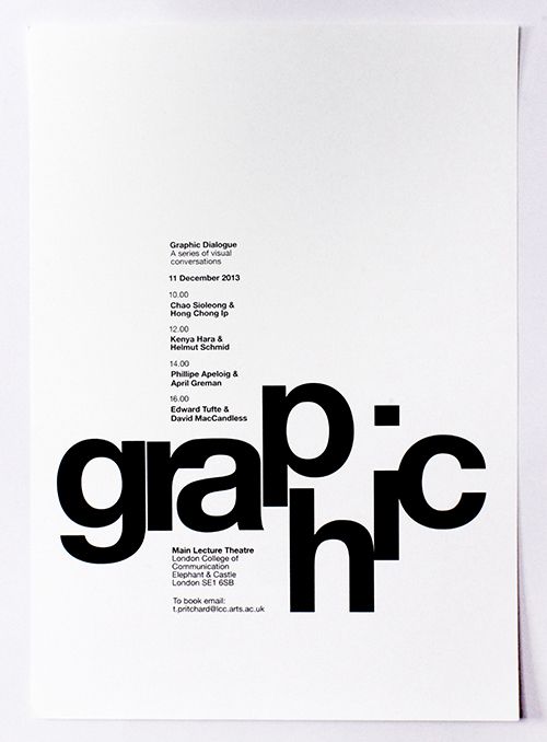
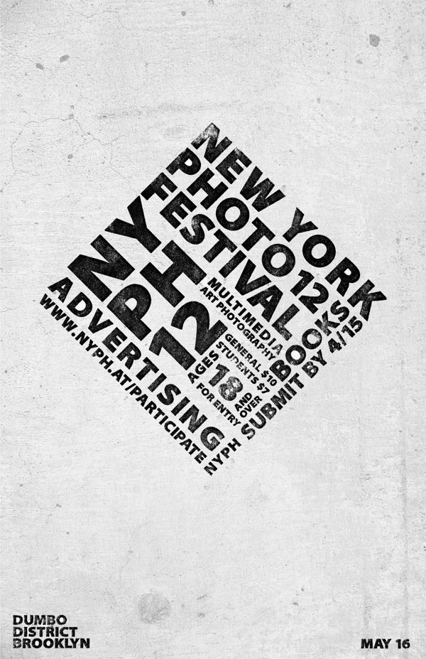
02 Experiment with typography
So much can be conveyed in an event poster from just from the fonts. Show seriousness with a bold sans serif, enhance elegance with an italic serif or express playfulness or fun with a loose handwritten font. When selecting fonts, choose at least two — One for the headline. One for body copy.
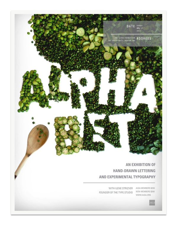
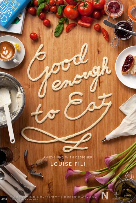
To create greater impact, experiment with typography. See how these two beautiful event posters have drawn inspiration from their subject: food! This is an example where an experimental composition really succeeds in giving an audience a taste of what’s to come.
If you’re going to experiment with typography like this, make sure your accompanying fonts are clean and simple.
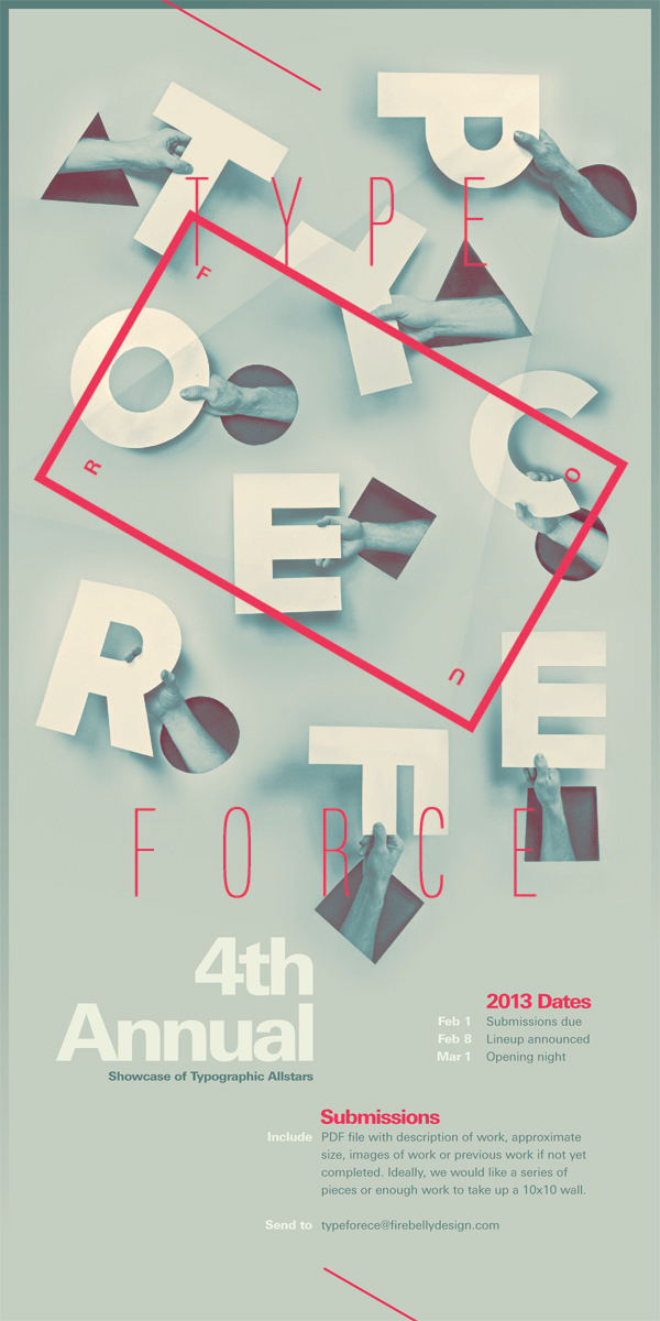
This is another clever example where the subject has been taken into consideration to influence the type (a poster promoting an annual tyogrpahy event). What better opportunity to get creative and inspire budding designers who plan to attend?
03 Create visual hierarchy
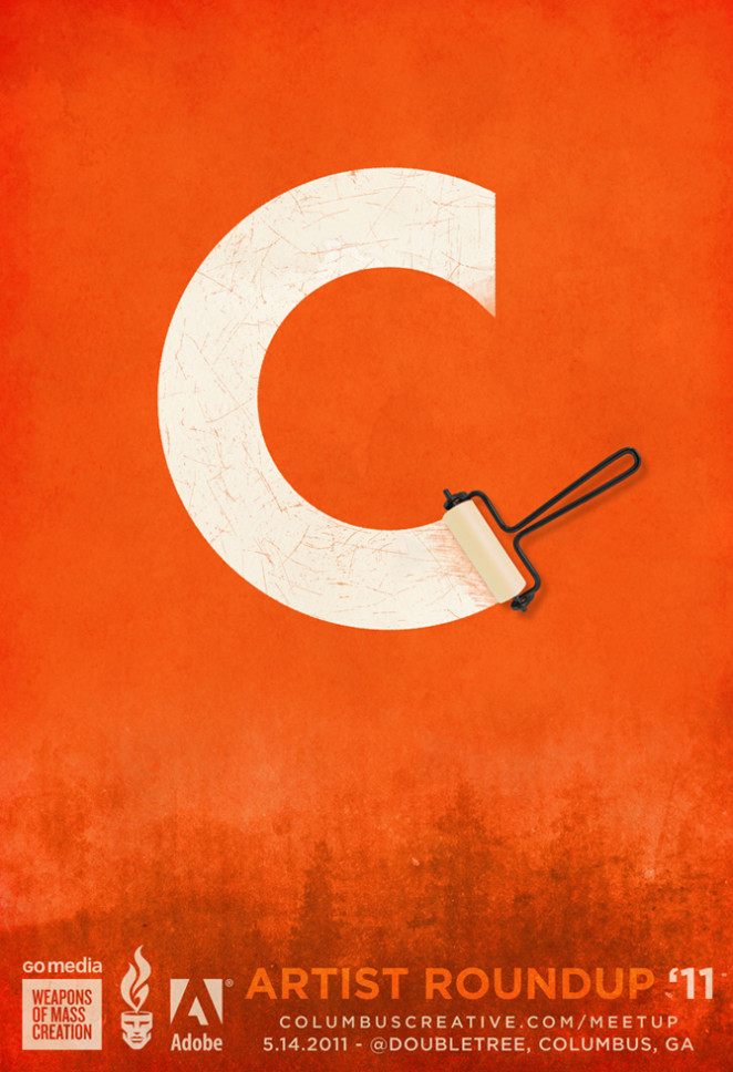
Posters should grab attention and be a quick read. Rank information in order of importance. If you’re working with little copy, go for a bold, simple graphic or photo like the Columbus Creative poster. If you have lots of information, have the type be your focus. Think about a big headline and group information into chunks.
04 Use negative or white space to form a clever composition
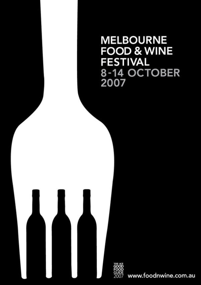
Creating an image from another image is something like magic. When it finally pops out at you, it’s amazing. It’s great how the Melbourne Food & Wine poster creates wine glasses from the fork prongs. Another way to use negative space is to draw the eye into a small object of focus with lots of negative space around it to let the viewer’s eye breathe. Drop your copy into the open space to draw the eye but don’t fill it.
05 Remove unnecessary elements. Say more with less.
Sometimes, less is more. It intrigues the viewer. A single word or dramatic image can communicate so much more than lots of words or intricate photos or illustrations. Don’t add extra graphics or words just for the sake of adding more.
Notice the similarities between these two posters. They both feature one dominant word to draw in the attention of the viewer, a lack of color and clean and simple type.
Minimalistic elegance we’re sure continued at the actual event.
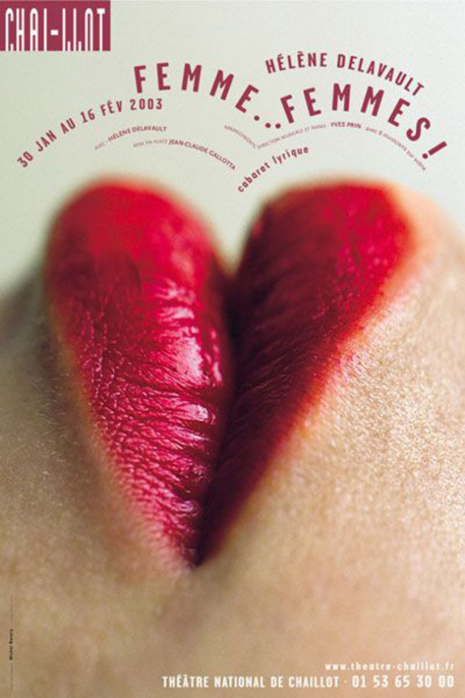
06 Create a point of focus
Use photography that’s in or out of focus to give more weight to the text. Or crop a photo tight to show the most important feature. This will create drama or to lead the eye around the page. The poster for the Theatre National de Chaillot could’ve used a photo of a woman’s entire face but by using just the lips, it creates passion and intrigue. Notice the bonus result of the lips forming a heart?
07 Use shapes to create visual interest
Shapes create other shapes. They create guide lines that lead the reader’s eye around the poster. Whether used to contain text, create an interesting composition or lead the viewer’s eyes in a particular direction – the use of shapes in event poster design is versatile and undeniably effective.
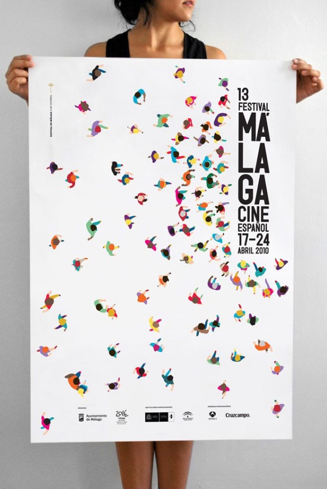
08 Be clever with your composition
Once you have your information, photos or illustration, think about how to break it up and put it back together so it reads easily to the viewer. Put pieces of information together like a puzzle. YOU decide how the viewer will read the poster and get the message. Pay attention to how graphics interact with words or letters.
This event poster for the Malaga Festival by Calamargraphic cleverly creates a focus towards the text in the top right of the composition by picturing several colorful figures running in that direction.
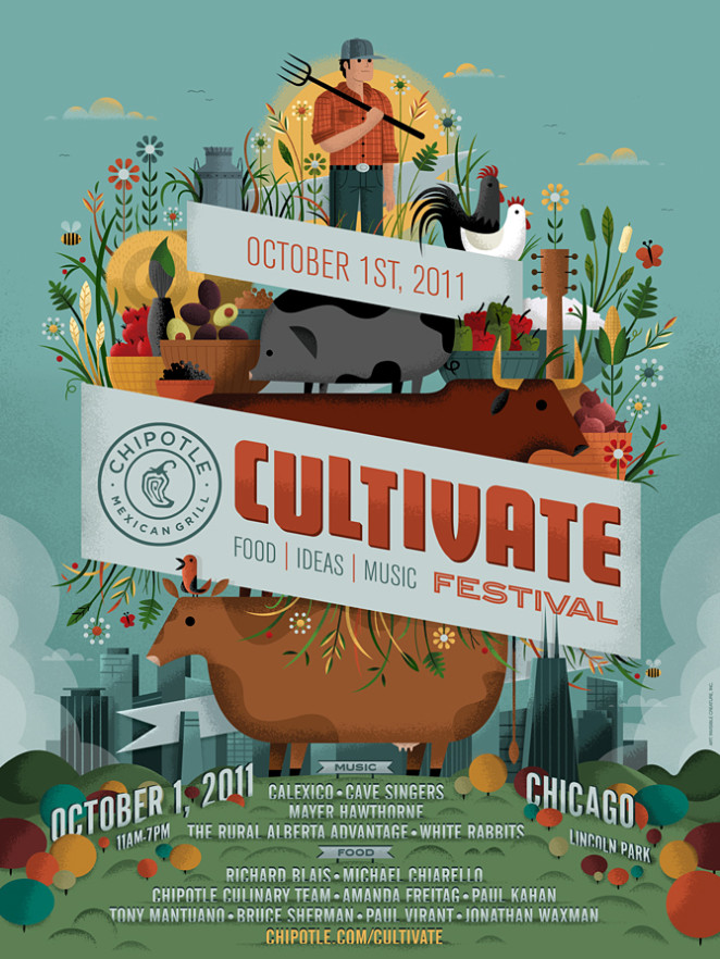
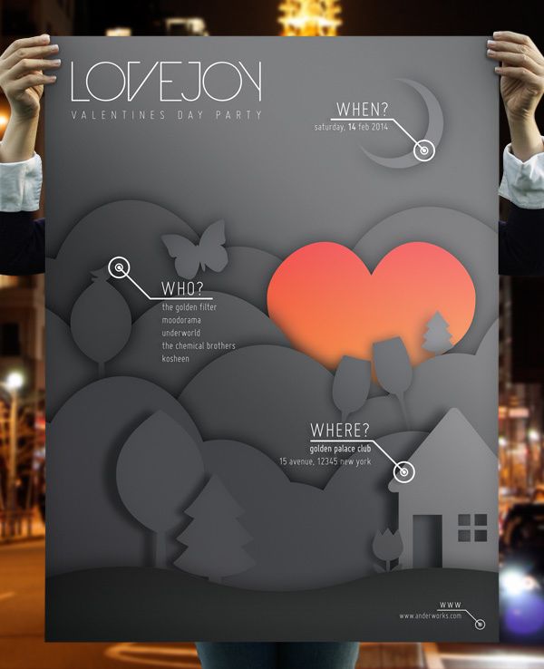
09 Play with layering to create depth and dimension
Layering images, colors and words creates depth and dimension. It sucks you into the little world created on the board. This Cultivate Festival poster layers a city with farm life. Words and images overlap each other.
This Valentines event poster also features a nice sense of depth, using strong shadows to make the composition seem 3D. Also note how the designer has placed the text in the layout next to objects that relate to their meaning. Clever.
Source: Canva