


25 Ways To Design an Awesome Poster: Part 2
10 Emphasize elements to create energy and drama.
When you use exciting, exhilarating photos, illustration and even fonts, you’ll create a serious impact and most definitely get a reaction from the viewer. They’ll be drawn in by the emotion and energy. Drama can usually be accomplished using fewer words too.
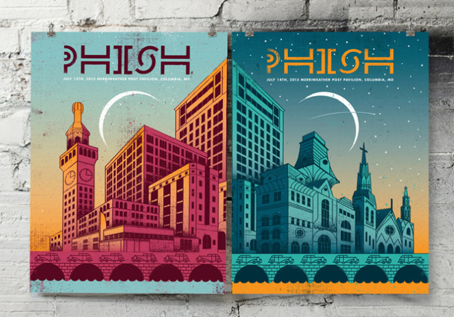
11 Take the viewer’s focus on a journey with clever perspective
Life isn’t always lived on a straight line. Different angles and points of view can make for a more exciting poster. Change the point of view of a photo. Take it from up high or down low. Use words on a diagonal instead of straight line. These Phish posters lead the eye either up or down across the page instead of just being straight and boring.
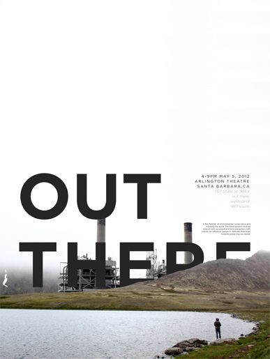
Or take this film festival event poster, which draws your eyes right “out there” with cleverly hidden type.
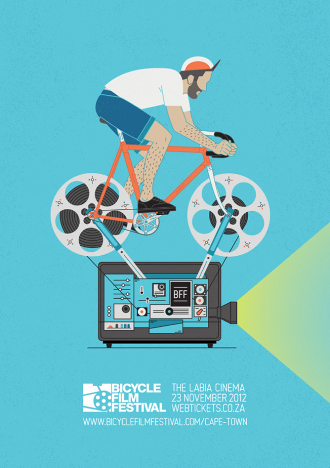
12 Don’t hesitate to use humour
Be silly. Have fun. Create a play on words. Use unexpected imagery, unless, of course, you have a serious subject. This poster for the Bicycle Film Festival could’ve been designed a hundred different ways from intriguing to exciting but they chose to be humorous and that piques the viewer curiosity as to what kind of fun they’ll have at the festival.
13 Ensure your composition is balanced
Using symmetry, centering and repetition creates balance for the eye. You can balance colors, weight of graphics, amount of text or a mix of them. Balance doesn’t mean the poster has to be perfectly centered. Is doesn’t mean that to be symmetrical it has to be the same on each half. It means that one side isn’t heavier, it doesn’t contain all of the information or all of the graphics.
14 Use photos to lend credibility to your poster
A beautiful, dramatic photo may convey your message. Photos lend credibility to your product. It makes it real and viewers can see the quality.
In this case, the designer has taken a creative approach and layered his own type onto a photograph of a model for a fashion event.

In another creative example, this designer has used a nice balance of photography and graphic design to create an interesting composition with an organic feel.
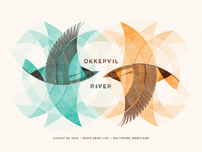
15 Use creative illustrations
Photography may not always suit your needs or you may not have the budget for photography. Instead you can create your own drama or characters. You can open up an entire world designed specifically for your purpose. Illustration can be flat or have layers and depth.
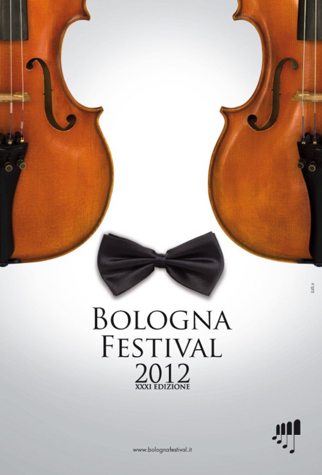
16 Embrace the odd and the unusual
Use an odd color or a unique photo. Go for unusual fonts. Put contrasting images together. Or align images and information to create something else altogether. The Bologna Festival poster does just that. Do you see the violins first or the man with the bowtie?
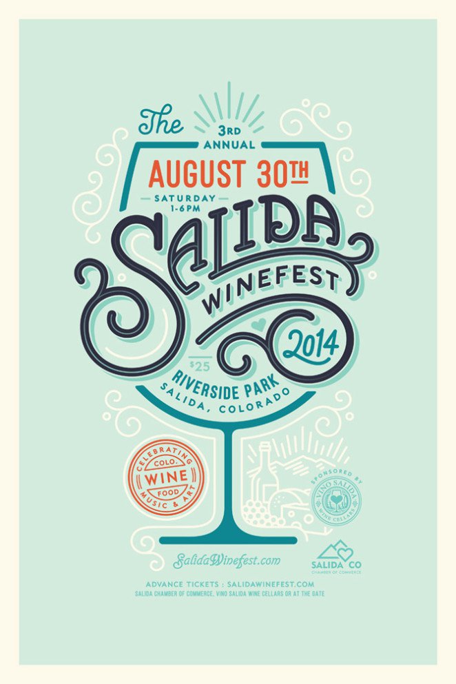
17 Ensure all of your graphic elements flow together
Know how you want the reader to get the information. Achieve that with use of color, lines, size and weight of text. Create a path for them to follow. The Salida Winefest poster literally does that. The viewer follows the path of text like wine flowing in the glass to consume the information.
Source: Canva