


25 Ways To Design an Awesome Poster: Part 3
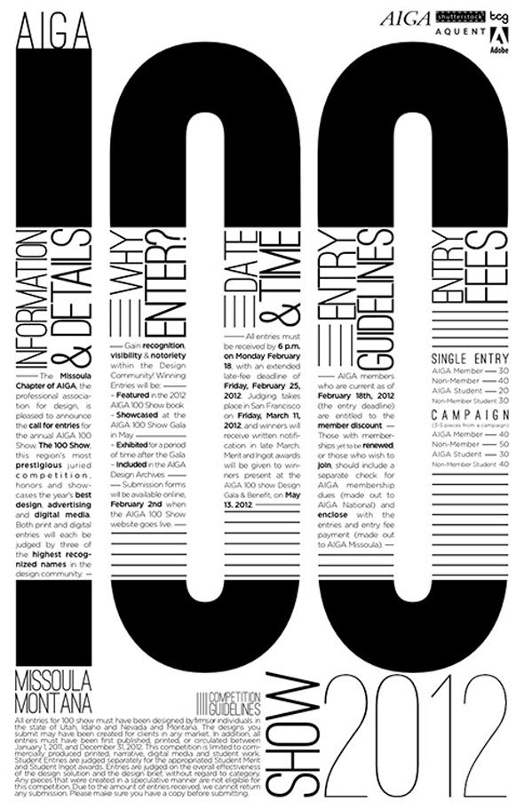
18 Make dense information legible
Being legible doesn’t just mean that the viewer can actually read the poster. Make sure the viewer knows what you’re advertising, selling or promoting. That it’s easy to read and understand. Make sure you can see it from a distance too.
This gallery event poster contains a large amount of information, but has been designed to make sense to viewers from a distance and up close. Given the dense amount of text – this creative layout achieves legibility in a difficult context.
19 Pay attention to formatting and size
Not all posters are designed the same, nor should they all be the same size. Vary the actual size of the poster if you know the space will allow it. And it doesn’t always have to be vertical. Try horizontal or even square. Go big, bold, different.
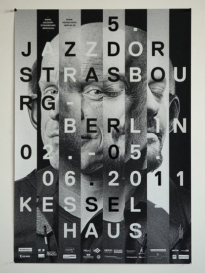
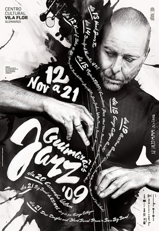
20 Design your poster to evoke emotion. This will make people more likely to share and engage with it.
A single word or image can evoke great emotion – love, anger, sadness. A photo of a woman crying. A man crossing a finish line. The word “fire.” The viewer gets emotional and needs to know more.
This poster by Helmo uses a fragmented composition made up of difference facial expressions to mimic the feeling of the jazz event – beautifully capturing the vibe.
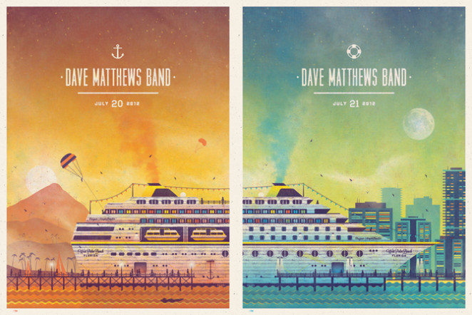
21 Create consistent templates to use for multiple events
When you have different events or products for a same music band or product line should there be more than one poster? Will a series of posters help showcase different products and events? When creating a series of posters, keep in mind that they should almost be the same except for image and color. But yet they should also stand on their own without the rest of the series. These Dave Matthews Band posters are almost the same but yet different. Each one works if posted alone too.
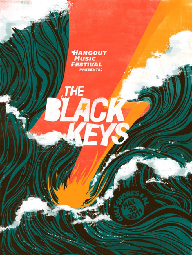
22 Design for your audience
You have to know your audience before you attempt to promote or sell to them. Make sure the design matches their likes, buying habits and culture. This Black Keys poster is sure to attract their rock fans for a beach side concert.
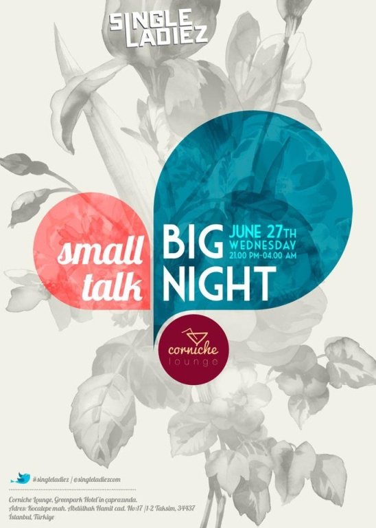
23 Play with contrast for a more interesting composition
Achieve contrast in a variety of ways. Choose opposing colors such as blue and orange or go for black and white instead of color. Partner bold, dramatic fonts with thin ones. Or use loud pictures with soft colors.
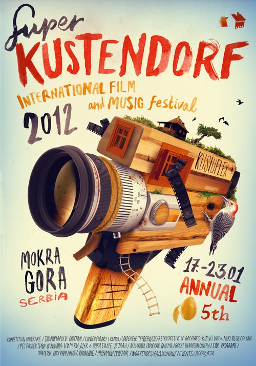
24 Experiment with different graphic elements like colors and fonts
To make it interesting, try a variety of materials and fonts. Use some illustration over photography like in this poster. Try romantic fonts with a gripping photo. Even combine any of the above tips since at all posters fit into one category.
25 Once you know the rules, push the limits and break them
Once you know the rules, push the limits. Experiment with colors, sizes, fonts you’ve never used or a couple that you think don’t go together. Try something new.
It’s your turn!
Once you know your event, service or product (a leadership retreat, a indie movie or a cool, new car) knowing your audience is key (yuppie, Gen Xer or middle-aged executive). From there, finding images, colors and fonts that embrace the message will lead to a great design. Should it be just words, a large photo or a one-of-a-kind illustration? Maybe bright and bold, or simple and elegant? The field is wide open. Now go create!
From there, finding images, colors and fonts that embrace the message will lead to a great design. Should it be just words, a large photo or a one-of-a-kind illustration? Maybe bright and bold, or simple and elegant? The field is wide open. Now go create!
Source: Canva