The biggest logo designs of 2015 so far
On the day a new logo design is launched for a familiar brand, the first reactions are usually overwhelmingly negative. Once some time has passed and the new design has entered daily use, though, it can be a different story.
So here we take a look back at the biggest brands to release a new logo in 2015 so far. Now you’ve got used to them, what do you really think of them? Let us know in the comments below!
01. Hillary Clinton
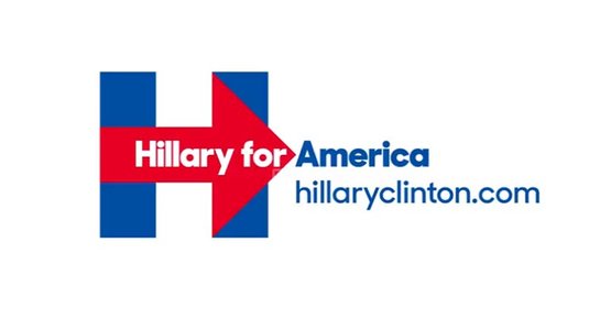
Hillary’s logo generated a huge social media response
In possibly the least surprising political story of the year, Hillary Clinton declared she’s officially running for US President. What was more surprising, though, was the new logo she released along with the announcement.
Created by Pentagram, the new design set social media blaze, with commentors pointing to the logo’s similarity to both the WikiLeaks logo and a hospital sign; the irony of the arrow pointing to the right; and even some bad-taste jokes about the Twin Towers.
Lots of designers joined in the fun, coming up with their own alternative designs for the Hillary logo. Creative Bloq readers joined in the fun with their own, tongue-in-cheek versions of the logo - check them out in the comments at the bottom of this news story.
02. Facebook

The new Facebook logo: a subtle but distinctive change
Earlier this month came the latest update to the Facebook logo – a subtle tweaking of its iconic Klavika typeface.
Frequent users will be familiar with the social media platform rolling out new logo redesigns. But this was the first time the company had changed its logo’s typeface since it launched as ‘Thefacebook’ way back in 2004.

Old logo - can you spot the difference?
The new typeface was a collaborative effort between Facebook’s own in-house design team and Process Type Foundry’s Eric Olson.
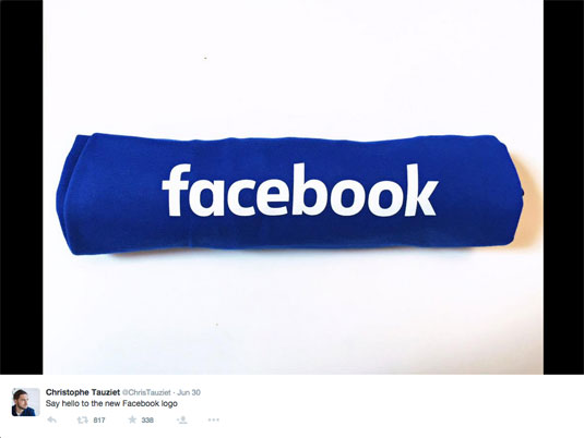
The new logo was revealed in a Tweet
Obvious changes to the font include a single-deck ‘a’ and a more organic stem on the letter ‘b’, while the all important ‘f’ remains instantly recognisable.
03. Royal Albert Hall
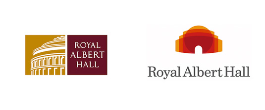
The RAH’s logo is dramatically different
The famous London performing arts centre had a communications overhaul in February, in a bid to appeal to a wider audience and a logo change was part of its new look.
The institution worked with strategy consultancy firm BrandPie’s charity arm and the purpose of the new logo was to emphasis the centre’s reputation as a world class venue.
The Hall’s distinctive silhouette is featured on the new five-colour logo which is designed for use across different media.
04. Banco Popular
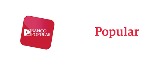
This bank logo loses the word ‘bank’ itself, pushing the boundaries of simplication
One of the biggest bank groups in Spain had a radical rethink of its logo this February: the name ‘Banco’ has been completely removed from the original logo which now just features the name ‘Popular’. The logo uses both serifs and a second case has been added.
A slanted line is often placed beneath the logo with taglines such as ‘Con Paso Firme’ (Firmly forward) used in advertising. The slanted line allows the logo to stand out against any background. The new logo was designed by the Madrid office of Brand Union.
05. Daily Motion
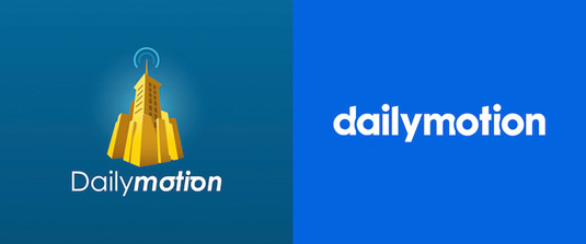
The video platform goes for typography only in its latest rebrand
One of the biggest video platforms on the web, boasting 300 million viewers on its player and 30 billion video views worldwide per month, Dailymotion came up with this new logo in March (right), saying goodbye to its icon and opting instead for a simple wordmark. It was created by London-based agency venturethree.
06. Electrolux
NEW LOGO: The new font was created specially for the Electrolux logo
Electrolux has been the leader in home and professional appliances since 1909. In January it unveiled a brand new identity (above) with an original font that’s unique to Electrolux.
The logo was designed by Prophet in London, who worked in close partnership with the Electrolux marketing team on the project.
“We set out to create a visual identity that would enable Electrolux to tell its story to the world in an appealing way,” says Hector Pottie, Associate Partner and Creative Director from Prophet, London.
OLD LOGO: The typeface was beginning to look a little tired
“It was crucial to present the benefit of a product and not focus on features. In addition, the identity has to work hard to stand out from the crowd and unify the brand at every point people encounter the brand.”
07. Lemark

NEW LOGO: based on an camera aperture
Lexmark, the well-known global manufacturer of laser printers, has unveiled a striking new logo and branding (above) in April.
When compared with Lexmark’s familiar red diamond motif (below), the new green shutter logo was a huge departure.

OLD LOGO: Lexmark is retiring its diamond design
The new design, it says, captures the company’s continuing evolution.
Danny Molhoek, managing director and country general manager UK/Ireland at Lexmark, explains that the previous diamond shaped logo was intended to evoke clarity and durability.
By adopting a shutter, the new design is intended to suggest opening and expanding possibilities. It was created by Moving Brands.
08. Alitalia
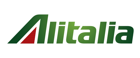
NEW LOGO: Alitalia gets a dynamic overhaul from Landor
Italy’s flag-carrier received a new brand identity in June courtesy of Landor. The new logotype was given a more dynamic makeover, retaining the green, red and white colours of the Italian flag, and a more dominant ‘A’ was introduced. It was described as “a bold statement of the heights the airline is striving to reach and its enviable experience in the field of aviation”.

OLD LOGO: The previous incarnation was more upright evolution of Walter Landor’s original design
Inspired in part by Formula 1 racing cars, striations were added to the red triangular interior of the Alitalia ‘A’, creating a pinstripe effect designed to reflect exclusivity, attention to detail and a strong focus on design.
The airline’s aircraft fuselages are now painted in ivory to reflect of understated Italian style, reminiscent of both original and new Fiat 500 colourways, and progressively banded rearward to create an impression of movement, speed and unhindered progress.
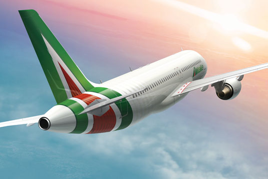
Italy’s flag-carrier has an all-new tail fin design
Peter Knapp, Global Creative Officer at Landor, said: “Walter Landor was involved in the design of the project nearly 50 years ago and now is the time to evolve this enduring brand and update it for today’s market challenges. We have added a subtle sophistication to the design, to the interior and exterior of the aircraft, which connotes the style, passion and craftsmanship of modern Italy.”
09. The New York Times magazine
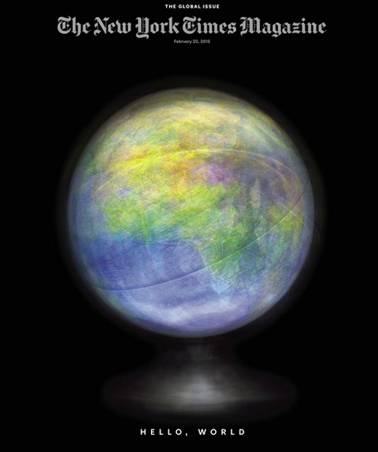
The New York Times magazine has a new logo and fontset
New York Times magazine, founded in 1897, regularly refreshes its design. In February it revealed its latest look, includes a new logo, shown below. The previous logo (top) has been redrawn by the typographer Matthew Carter, with the new design (bottom) described by the title as being “more modern, more graciously spaced”.

The new logo (bottom) is more “graciously spaced” than the previous version (top)
More strikingly, there was also a new short-form logo for the magazine, for use in smaller and more casual settings like its Twitter page.
A simpler logo for small screens and social media
The redesign was led by the title’s design director, Gail Bichler and art director, Matt Willey, working closely with the designer Anton Ioukhnovets.

All-new typography for the mag
Bichler and Willey have also also overseen the creation of an entire suite of typefaces for the publication, shown above.
10. Freeview
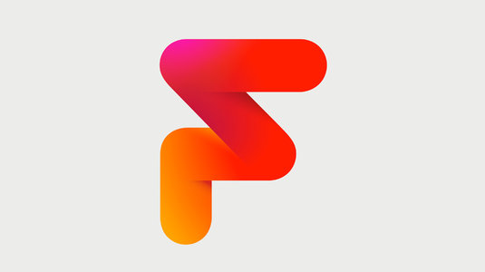
The new Freeview logo is a vibrant and colourful
In February Freeview, the UK’s most watched digital TV service, underwent a major rebrand, led by creative agency DixonBaxi. The move is part of Freeview’s strategic drive to bring connected television to a mass UK audience.
The old logo
The new logo retains the red heritage of the brand, but has been completely redesigned with added dimension - an angular form that suggests agility, choice and a sense of fun.
11. YouTube kids
A safe space for kids watching videos online
On 23 February, YouTube launched a free app titled YouTube Kids for Android and iOS, described as “the first Google product built from the ground up with little ones in mind.”
Its logo was created by Hello Monday, who also designed the entire brand identity, including the product interface.
“The visual identity draws from the original aesthetics of YouTube, the mother brand,” they explained. “It’s fun, quirky and embodies the YouTube Kids brand.”
12. Andy Murray
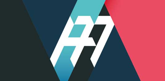
The clever design combines ‘AM’ with ‘77’
Yes, you read that right. Andy Murray now has an official logo. It was created by brand storytelling agency Aesop to create a uniform visual identity across of the tennis player’s commercial ventures, from endorsed products to his own branded products.
The design combines Murray’s initials with the number 77, to celebrate his Wimbledon victory on the 7th day of the 7th month, a full 77 years since a British player had won the contest.
13. Olympics 2020
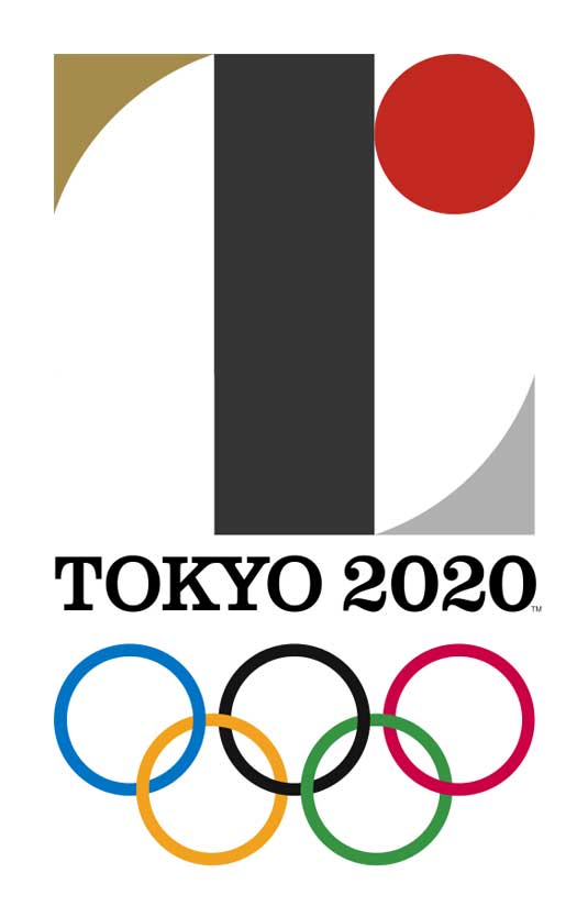
The official logo for the 2020 Summer Games
We haven’t yet had the 2016 Olympics. But already preparations are underway for the next Games after that, to be held in Japan in 2020. And this week Tokyo launched the event’s official logo design, in both static and animated form.
The logo is immediately striking for its abstract and minimal design, particularly when compared with the brighter and more colourful Rio 2016 logo, perhaps reflecting the difference in cultural outlook between the two countries.
The shapes form a ‘T’ for Tokyo, and some have suggested you can see a ‘20’ in there if you can squint. There’s also a separate logo for the 2020 Paralympics:
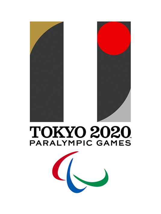
The official 2020 Paralympics logo
It’s an inverted variation of the Olympics’ logo, with the outer columns coloured black instead of the centre. The two vertical, parallel lines, the press release says, represents an equals sign (‘=’).
This slick animation shows the Olympics logo transforming into the Paralympics logo:
Source: Creative Bloq


