


How to fix a bad user interface: Part 2
ERROR STATE
The screen when things go wrong. Typically, this is more complex than just one screen, since errors can occur in surprising combinations. Error states can include anything from form data that’s missing or invalid; an inability for your app to connect to the server; trying to move forward to the next step without finishing an upload, leaving a page without text submitted, and more.
Error states should also be comforting in the sense that your product keeps all user input safe. Your product shouldn’t undo, destroy, or delete anything entered or uploaded by your customer in the event of an error.
It’s apt to paraphrase Jef Raskin, creator of the original Macintosh and author of The Humane Interface. He writes: “The system should treat all user input as sacred and — to paraphrase Asimov’s first law of robotics, ‘A robot shall not harm a human, or, through inaction, allow a human to come to harm.’ The first law of interface design should be: A computer shall not harm your work or, through inaction, allow your work to come to harm.”
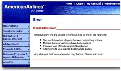
This advice could be well-heeded by some particularly vile offenders of this rule: airline websites. Missing a tiny form field for a credit card security code, for example, frequently results in a page reload that blows away all of your meticulously-entered details while highlighting the missed field with an offensive red hue.
 So long, and thanks for all the fish.
NO! YES! MAYBE?
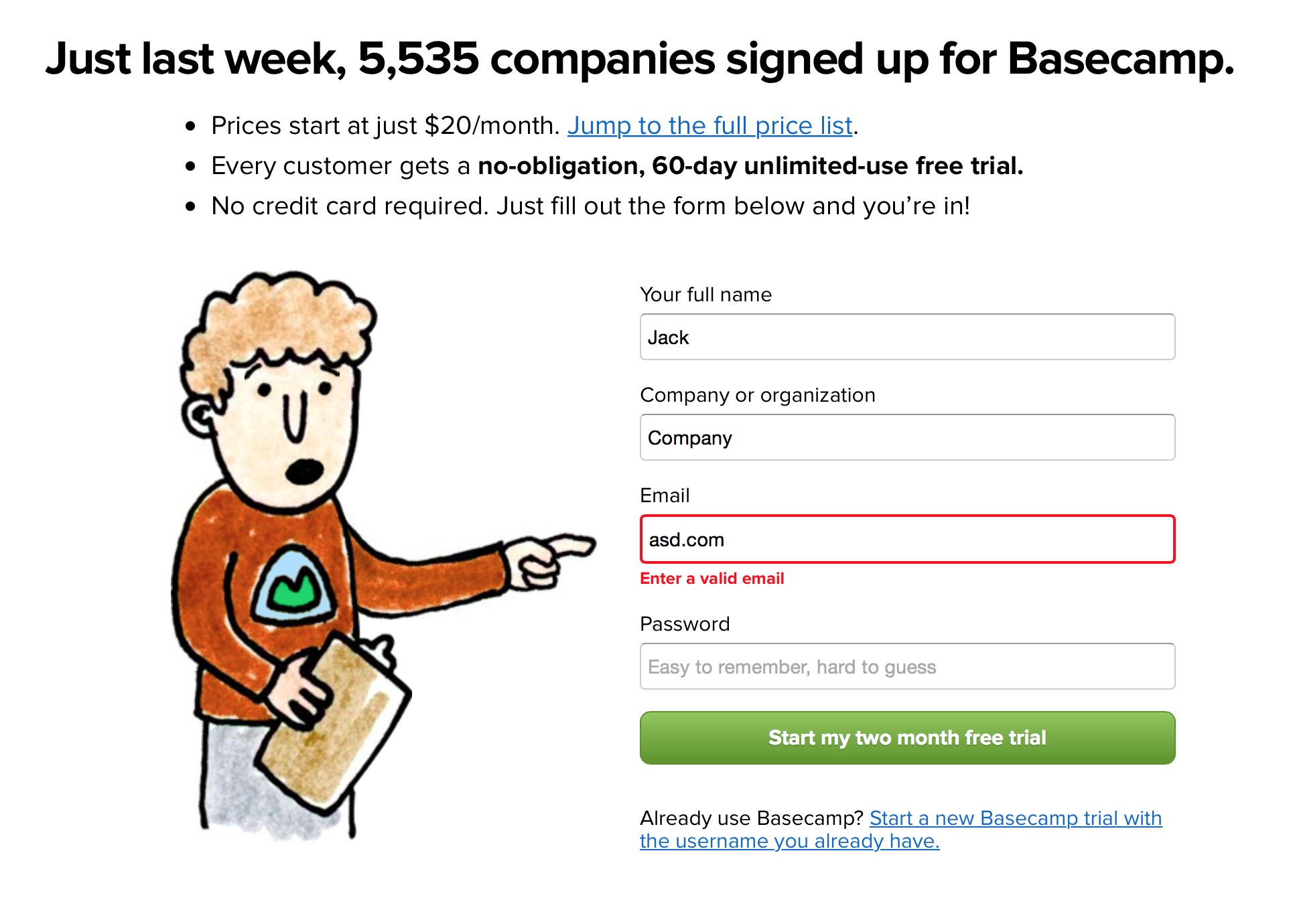
Ah, finally, a contextual error message we can follow. Bonus: we get a little sense of humor to humanize it.
Ideal error states occur dynamically without destroying any data input by the user. If a page reload must occur to detect an error, please do everyone a favor and save whatever data — however flawed — was input into your product. Typically, though, page reloads to detect an error is a sign of laziness. For the sake of your customers, ensure you and your developers go the extra mile to handle errors in graceful and accommodating ways.
Additionally, error states shouldn’t be dramatic, nor should they be vague. Remember the “Blue Screen of Death?” The Mac’s “Kernel Panic?” Or — for those computing veterans — “Abort, Retry, Fail?” Each of these error states, by necessity, mark a significant system error requiring a computer reboot or retry. But to this day, each of these error states are well-remembered because of the shock, fear, and confusion each of them conveyed to the end user.
 Microsoft’s Blue Screen of Death became so infamous because it simply freaked people out. The blue screen — while better than a red one — was out of context, abrupt, and filled with scary-sounding jargon, even if it was useful in debugging the problem.
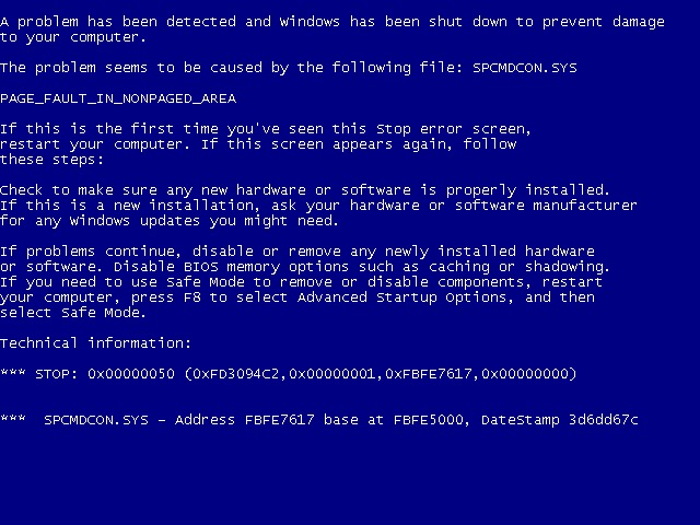
That’s because error states must incorporate concise, friendly, and instructive copy as to what to do next. Vague error codes, hexadecimal numbers and confusing advancement options are only going to scare and frustrate the people who experience these errors.
Of course, your product’s audience might consist of rocket scientists or computer engineers. Then these highly-technical error messages may be well-suited to your customer. But as most of the world adopts software in their everyday lives, these types of error messages become less and less appropriate.
It’s simple. Make error messages human, not technical, and suited to your audience. What would you want to be told when something goes wrong?
The error state is such a widespread occurrence, and one of the least-desirable states for which to design. But I promise that if you put as much care into this state as you do into the previous two states, your product will be infinitely more joyful to use — and, more helpful, as you’ll have thought through common customer pitfalls and solved them in advance.
PARTIAL STATE
The difference between an error state and an ideal state is like night and day. But how does the screen look when there’s only one row of data? A few photos? A half-completed profile?
The partial state is the screen someone will see when the page is no longer empty and sparsely populated. Your job here is to prevent people from getting discouraged and giving up on your product.
This is a great opportunity to design micro interactions to guide people towards the full glory of the Ideal State. It’s a journey on which you take your customers to help them realize the true value of your product. This implies an accomplishment — that your customer has spent some time in your product to see a glimpse of its potential. Keep them hooked.
Some game design principles can be useful here. I’m not referring to the scourge-like practice of making your customers gather crystals to advance a la Clash of Clans, but instead building what is called acceleration into this state of your product. It’s a game design term that helps a player visualize how they’ll be more powerful in the future, guiding them along a predefined series of tasks to complete to achieve this vision. The trick is to make the player not realize they’re performing what could be perceived as tedium in order to extract the maximum value from your product.
“Players entering an acceleration phase aren’t thinking about the tedious repetitions they have to perform in order to level up, they’re just doing them, and enjoying the accelerating rate of the results…Rather, those players are caught up in a future in which their character(s) will be powerful in a way they can’t even understand yet. To put it more technically, they’re inferring an exponentially increasing power structure that vanishes beyond their player prediction horizon. It’s not exactly the same as traditional flow, but the exhilaration of the players is subjectively very similar.”
Here are some great examples of the Partial State in the wild…
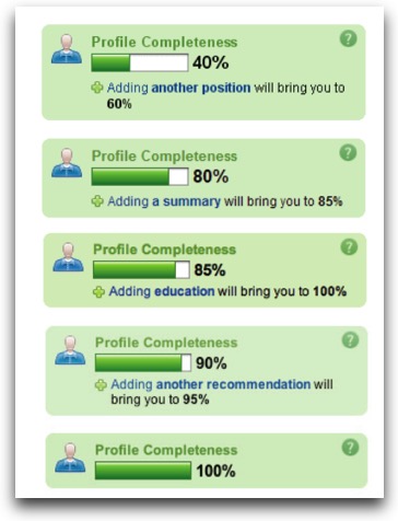
 LinkedIn’s famous “Profile Completeness” bar, encouraging you to perform exact tasks to achieve 100%. Completionists cheer.
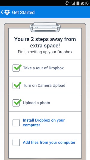
 Dropbox shows you how close you are to achieving some extra storage space, which is a major attractor for most Dropbox customers, I’m sure. Not only does Dropbox show you how many steps you have left to complete, but these steps also have the side effect of making customers more valuable through education and activation.
LOADING STATE
It’s easy to overlook this state, and many product designers insert it as an afterthought. But there’s a very real burden that comes with setting expectations. When your app is loading data, waiting for an Internet connection, or transitioning to another screen, you must take great care to be mindful of how you represent situations where you’re fetching data. This can consist of an entire page takeover, lazy loading of content panes, or inline loading, potentially used when one might look up username availability from a form field.
And the perception of loading is equally as important. Too often designers simply fill their screens with whitespace and spinners, placing a massive burden of responsibility on the content that isn’t there. This, in turn, encourages your customers to figuratively watch the clock — putting the focus on the indication of progress versus actual loading progress being made. Such is the belief of Luke Wroblewski, a product design expert that’s led design teams from eBay to Yahoo! to Google, where he now resides after selling his mobile polling startup Polar.
Wroblewski and his team discovered that after implementing a series of loading spinners for each poll, Polar customers began complaining that the app seemed slower, saying things like “There seems to be an excessive amount of waiting around for pages to refresh and load — it doesn’t seem as quick as the previous version.”
Wroblewski realized that:
“With the introduction of these progress indicators, we had made people watch the clock,” he said. “As a result, time went slower and so did our app. We focused on the indicator and not the progress, that is making it clear you are advancing toward your goal not just waiting around.”
SKELETON SCREENS
This realization directly resulted in the creation of what he calls “Skeleton Screens.” It’s a technique now being used by Pinterest and Facebook in both their web and mobile versions.
Skeleton Screens are an innovative take on the loading state — it places the focus on the content as it loads versus the fact that the content is loading. This is accomplished by displaying the basic structure of the page and gradually filling in the missing pieces as they download. The beautiful thing about this technique is that it can eliminate spinners completely. And it can increase the perceived performance of your product.
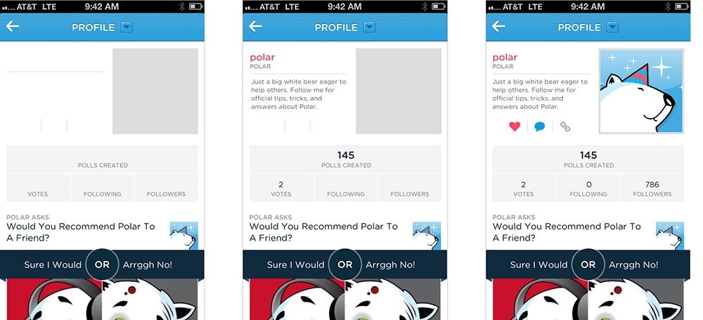
 Luke Wroblewski’s app, Polar, and its skeleton loading screens.
Pinterest, while employing the use of the Skeleton Screen loading state concept, put a unique twist on its implementation: deriving the “average color” of the pin’s image and using that color to fill in the pin’s background. So before the pin’s image loads, you feel like you get a preview of what the pin will be. 
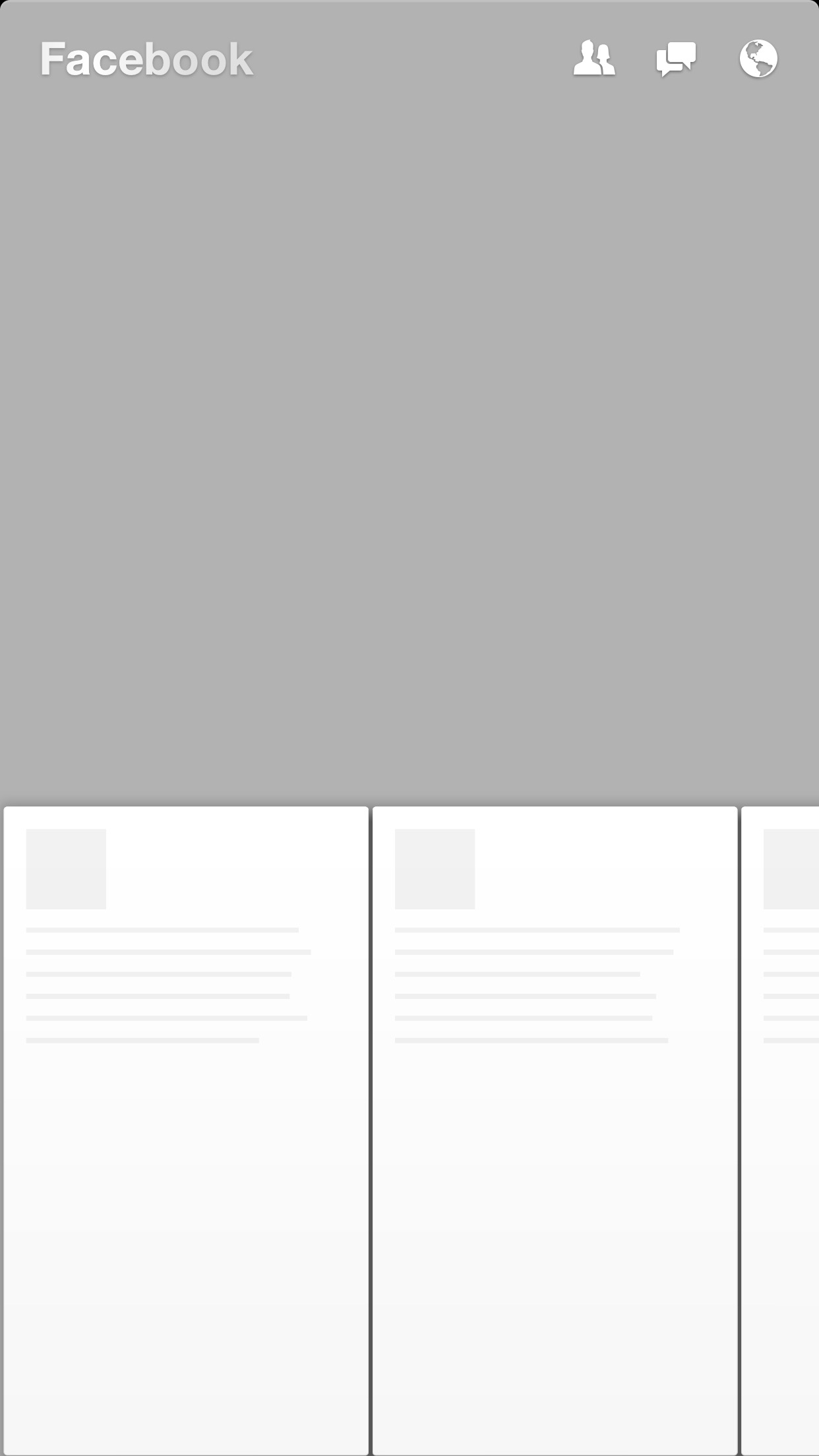
Facebook invented a similar technique used in their mobile app Paper and later implemented it into their web version. Combined with what they call the “shimmer effect,” the Facebook experience will display a stylized Skeleton Screen with shapes resembling content. And to communicate that the content is loading, the shapes will pulse with a shimmering effect.
ASSUMING SUCCESS WITH OPTIMISTIC ACTIONS
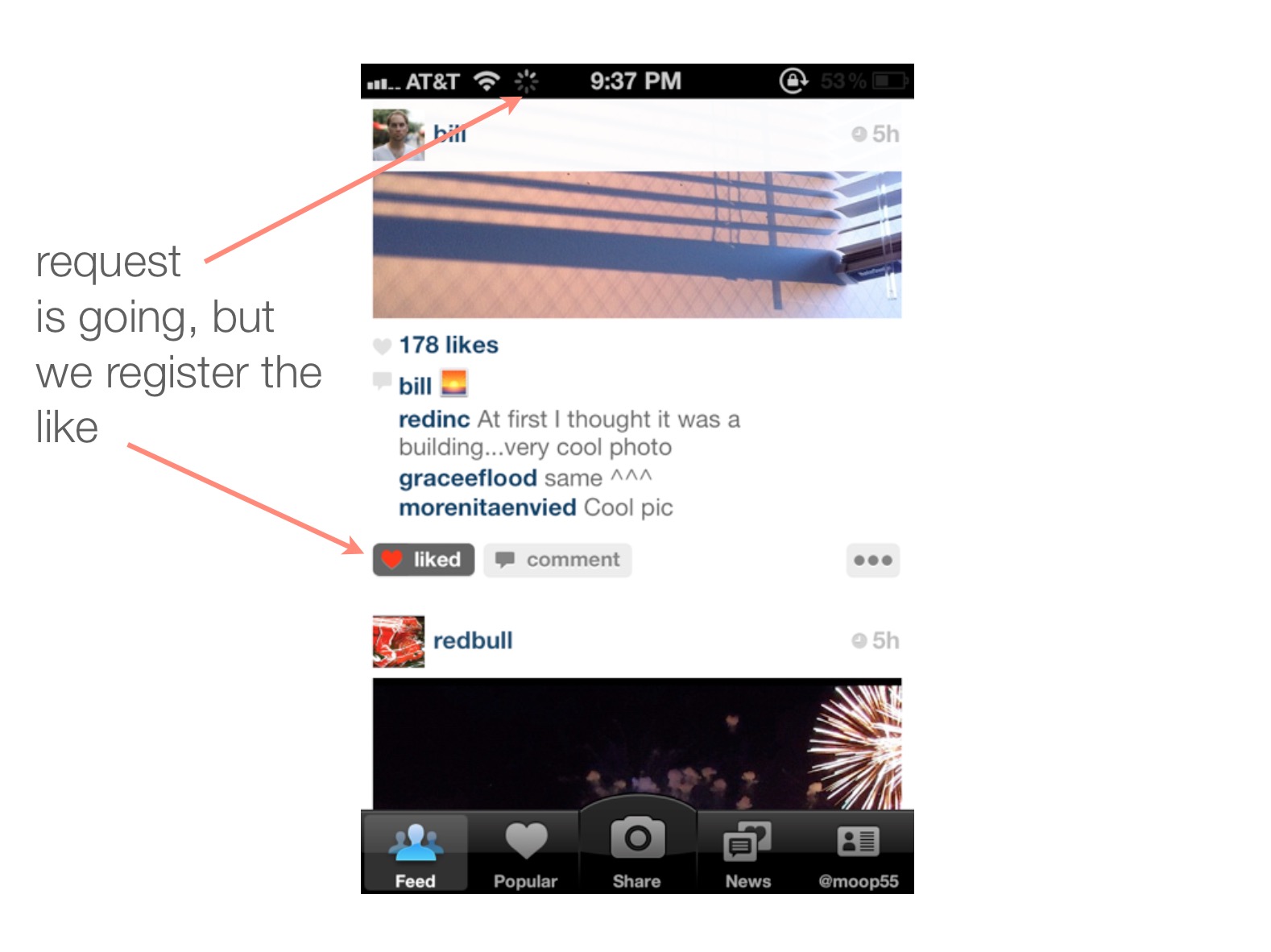
“Nobody wants to wait while they wait,” said Instagram co-founder Mike Krieger in 2011 as he described how his engineering efforts achieved the app’s perceived speed.
Krieger, in fact, pioneered the notion that actions should be performed “optimistically” by a product. By assuming an action’s success, actions appear to take place much faster.
Take the case of “liking” a photo or leaving a comment. In both cases, the action is registered as completed instantly from the perspective of the customer. And in the background, the product is making server requests to actually complete the action.  Optimistic actions can also greatly help to reduce the perceived speed of uploading media. Instead of uploading when a user taps “Done” at the end of the photo upload flow, Instagram starts uploading the photo immediately after a filter is selected. While it’s not an optimal engineering solution — and data might get thrown out if your customer backtracks — it makes uploads appear to happen very quickly. Following the “move bits when no one’s watching” mantra can help make your product’s speed one of your assets.
You’ve seen a number of examples of the UI Stack and its five states in isolation. But how would they work together? How does the UI account for the transitions between each state?
That’s the power of the UI Stack. These states don’t exist in vacuums. They exist on a vertical axis that can be called at any time by the product. It’s your job not only to account for each of these states, but to dictate how the screen moves between each state.
I’ve created a hypothetical messaging app to illustrate these ideas.
Why a messaging app? Because it’s not an immediately obvious example of these states at play. But I think it’s a great example of how even temporal UIs like messaging interfaces follow the rules of the UI Stack. And, even further, it’s an illustration of how immense our responsibility is to ensure that each screen’s states flow smoothly from one to another. So what do we have to deal with in a messaging app?
We have to account for when there’s no messages. This is our blank state.
Our partial state is when only one party has sent a message.
Then, there’s receiving a message — the typing indicator. This, in other words, is our loading state.
But wait. There’s another series of loading states — when we send a message out. And then there’s the delivery confirmation. An error can happen along the line, too. That’s when our message fails to send.
And you can’t forget the mechanism by which we recover from an error, and attempt to send again. There’s another version of the loading state.
Finally, we reach our ideal state: when messages turn into a conversation.
A HYPOTHETICAL EXAMPLE
Let’s say Marty and Doc just exchange numbers and Marty wants to message Doc about what he’s just seen at Twin Pines Mall.
Since there are no messages, we have an opportunity to exploit the empty state and encourage the customer into acting how we want them to act — in this case, that’s sending a message.
But what happens to this state when a message is sent? We need to gracefully wash away the empty state and shift it into a partial state: in this case, that’s when Marty sends only one message.
Let’s fast forward to when Doc has responded. He’s sent one message — but he’s not done yet! Hence the typing indicator, another form of a loading state.
Once the typing is done and the message is sent, we transition out of the typing indicator and bring in the new message, pushing the others out of the way.
But what about when Marty wants to reply back? First, we have to show some state awareness when there is text in the field — notice how the “Send” button turns from grey (a disabled state) to blue (an enabled state). Then, once we send the message, another loading state occurs for our send process. We keep the message dimmed during this time because there’s not a successful delivery yet — until the “delivered” stamp tells the customer that all is well.
But what happens if the message isn’t successfully delivered? Here comes our error state. The red marker replaces the loading spinner, and we’re left with a message in the “undelivered” dimmed state. Tapping (or, in this case, clicking into the Quartz Composer prototype) on the undelivered message retries the send. We’re in luck this time, and the message fills in after the angry red “!” disappears and we can register a delivered indicator.
HERE, IN THE REAL WORLD…
And that, my friends, is the UI Stack in action. It’s the five screen states and the seamless transitions between them. Without these transitionary elements, we risk confusing or surprising our customers as new states appear and disappear. Making people uncomfortable and confused isn’t exactly in our job description, now, is it?
In the end, the implementation of these states requires an intense collaboration between design and development. Invest time in each of them — they all work together to create the best, most holistic experience for your customer.
A PLOT SUMMARY OF THE THRILLING TALE YOU JUST READ
- Don’t get stuck designing only for your Ideal State and tacking on the other states. Your product solves a problem. How can each screen’s state handhold your customer to that goal?
- Read Samuel Hulick’s The Elements of User Onboarding.
- Make your loading states a part of your prototyping efforts. They’re a part of your product’s experience and shouldn’t be tacked on last. Huddle with engineering to figure out ways to make perceived — and, if possible actual — performance better.
- Spend time thinking through edge cases that can trigger errors. How will you handle them? What’s the friendliest response you can give your customer? There is a cost / benefit tradeoff here, but at least cover the most painful errors and go to great efforts to preserve your customers’ data.
Source: The blog of SCOTT HURFF